01When did the tool become an object?
In the kitchen of the nineteenth century, objects were either ornate or not thought about at all. The silver service stood in the display cabinet; the pot, the grater and the mortar that did the work were inside the cupboard. They were two separate worlds. What was beautiful was not used, and what was used was not shown.
Three things broke down this separation. When electricity entered the home, new appliances with motors, heating elements and lights appeared, and there was nowhere to put them away; they had to stand on the worktop. As domestic service declined, the person working in the kitchen became the owner of the home, who began to look at the tool being used. And there is the depression of 1929, which is also a subject of our article on the history of design: when sales stopped, manufacturers discovered that changing the outside of a product made it sell again.
From that day on, the story of the everyday object is a contest between three questions: does it do its job well, does it look good, does it harm its owner? Good design answers all three at once. Each of the brands below has put its weight on one of these questions, and some have paid the price of forgetting one.
02The kitchen: the machine comes out onto the worktop
KitchenAid and Egmont Arens. The first stand mixer for the home appeared in 1919; it did its job, but it looked like a workshop machine. In the mid-1930s the company turned to the designer Egmont Arens. The Model K that Arens drew in 1937 had flowing lines like the cars of the period; its bullet-shaped head tilted back, so that the attachment could be changed easily. Its price was USD 55. The really surprising part is what came afterwards: the model that stands in the shop today can hardly be told apart from that of 1937. That the attachments fit every generation was also a selling point from the start. The fact that a kitchen appliance can stay the same for eighty years shows that its form came not from fashion but from its job.
Bialetti and the Moka. Alfonso Bialetti learned metalworking over ten years in the aluminium industry of France, and in 1919 he set up his own workshop in Piedmont. The patent for the aluminium coffee pot with an octagonal body dates from 1933. In the first years Bialetti sold it only at the weekly markets of the surrounding area. The person who turned the product into the symbol of a country was his son Renato, who took over the business in 1946: he reduced the whole range to a single product and began a large publicity campaign. The Moka carried the espresso of the coffee bar into the home. The design lesson is plain: a new material, a single product, a patient manufacturer.
Kenwood and the two Kenneths. Kenneth Wood presented his first kitchen machine at a home exhibition in 1950. In 1958 he wanted to renew it and turned to a young designer, Kenneth Grange; Grange said he would do the job in three days. The new model, which appeared in 1960, gave up rounded lines for an angular, calm form; it is written that Grange was influenced by Braun’s approach. Two details reveal the psychology of design: Grange deliberately made the machine heavier than its predecessor, because buyers identified weight with quality; and he designed it “over-engineered”, so that it would last for generations. That model is still passed from hand to hand in working order today.
OXO and the peeler. At the end of the 1980s Sam Farber, a retired manufacturer of kitchenware, saw that his wife Betsey was having difficulty peeling an apple; Betsey had arthritis in her hands, and the peeler with its thin metal handle could not be gripped. Farber asked the Smart Design team in New York for a peeler that was easier to hold. The first range of fifteen pieces, presented in 1990, had thick, soft handles. The peeler was sold at almost three times the usual price, and it sold very well. The principle that follows from this is known today as “universal design”: what is solved for the user who has the most difficulty becomes better for everyone.
Why are good kitchen appliances heavy? Part of it really is because of a robust motor and a cast body. But part of it is done on purpose: the hand takes what is heavy to be of good quality. The designer of the Kenwood said this openly. For the same reason the weight in the hand of a good door handle, a lighter or a pen is designed too.
03Braun and Dieter Rams: less, but better
Max Braun founded his company in Frankfurt in 1921; it produced radios and electric shavers. When his sons took over the business after the war, the radios of the period were inside polished wooden cabinets, dressed as furniture. The Braun brothers chose another path: they began to work with the Ulm School of Design, and especially with Hans Gugelot, a teacher there.
Dieter Rams joined the company in 1955 not as a designer but as an architect and interior architect; his job was to arrange the offices. A year later he designed the SK4 together with Gugelot: a device with a white metal body and wooden side panels that combined a radio and a record player in a single body. Rams’s contribution was the transparent acrylic lid. Competitors mockingly called it “Snow White’s coffin”; the name stuck, and the transparent lid became the standard for all later record players. For the first time the record player had come out of the cabinet and become something to be shown.
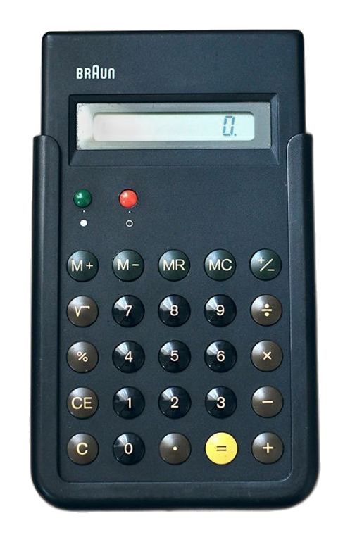
In 1961 Rams became head of the design department, and he stayed there until 1995. The team was small and the division of work was clear: one person looked after kitchen appliances, another after scales, model making and product graphics, and Rams worked on radios, record players and projectors. The T3 pocket radio of 1958, the travel clocks of 1971 and the ET66 calculator of 1987, designed together with Dietrich Lubs, are parts of the same language: few buttons, legible lettering, neutral colour, and an accent of colour only where it is needed.
Rams summed up this language in ten principles. The principles say that good design is innovative, makes a product useful, is aesthetic, makes a product understandable, is unobtrusive, is honest, is long-lasting, is thorough down to the last detail, and is environmentally friendly. The tenth is the one quoted most often: good design is as little design as possible.
The other half of the story is told less often. In 1967 an American razor-blade giant acquired the majority of the company’s shares. Rams’s team also designed a razor handle for that company; the handle was permanent, and the head was thrown away and replaced. The signature of a designer who argued for long life had been put on a disposable business model. In later years Rams became one of the sharpest critics of waste.
Why is the calculator on your phone so familiar? The calculator application of the first smartphones clearly resembled the Braun ET66 of 1987, and the first pocket music player the T3 radio of 1958. The team that designed the new device never concealed this debt. That the buttons on the screen are round and colour-coded is a decision taken in Frankfurt sixty years ago.
04Bang & Olufsen: when the audio device becomes furniture
In 1925 Peter Bang and Svend Olufsen began to make radios in a small town in Denmark, in the attic of the Olufsen family’s farmhouse. Their first invention was technical: in the years when most radios ran on batteries, a radio that ran directly from the mains socket.
The company’s association with design begins in the 1960s. Jacob Jensen began to work as chief designer in 1964 and developed 234 products in twenty-seven years. The company had been willing to produce only fifty of the first Jensen record player; thousands were sold. Jensen’s language is horizontal: low, long surfaces of aluminium and dark wood, sliding controls, devices that turn into a perfectly flat slab when closed.
The Beogram 4000 of 1972 is the peak of this language. Instead of describing an arc over the record, the tone arm moves in a straight line, just as the record was cut; a second, small arm senses the record with a light cell mounted on it. A technical solution determined the whole appearance of the device. In 1978 the Museum of Modern Art in New York showed twenty-eight audio devices that Jensen had designed for this company in an exhibition of their own.
After Jensen, the British designer David Lewis continued the line; he had begun to work with the company in 1965, and after 1980 he designed most of its products. The six-disc music system of 1996 shows the discs side by side behind a glass door; a carriage slides from one disc to the next. The device can be used horizontally, vertically or on the wall. Listening to music has been turned into a movement to be watched.
One habit of the company is also important from the point of view of design: it does not put designers on its staff but employs them from outside. An independent designer can say “no” to the engineer. There is another side too: these devices are expensive, and critics have asked from time to time whether the money goes into the sound or into the appearance. The question of what happens when form overtakes function has always remained open in the history of this brand.
05Alessi: architects in the kitchen
In 1921 Giovanni Alessi set up a workshop for working brass and nickel silver sheet in a lakeside town in northern Italy known for its metalworking. For fifty years the company made sturdy, plain tableware for hotels and bars. The transformation came with the third generation, in the 1970s and 80s: instead of drawing its products itself, the company began to have them drawn by outside designers, and especially by architects.
The experiment was carried out in 1983 under the name “Tea & Coffee Piazza”: eleven architects were each asked for a tea and coffee service; each was designed like a small building and produced in a limited number. It was an experiment made not to earn money but to see who had a feeling for kitchenware. Two names stood out: Aldo Rossi and Michael Graves.
In the same years three kettles set the direction of the brand. The whistle of Richard Sapper’s kettle of 1983 does not produce a single note; when the water boils it sounds two notes at once, E and B, in harmony. Michael Graves’s kettle of 1985 has a small bird on its spout, and when the water boils it is the bird that sings; for fifteen years this kettle was the company’s best-selling product. The third, Philippe Starck’s kettle of 1989, shows the limit of this approach: its appearance was striking, but it was difficult to use, and it was soon withdrawn from production.
The story of Starck’s lemon squeezer of 1990 is often told. The company had asked him for a tray. For months nothing was heard; then an envelope arrived, and in it was the paper place mat of an Italian restaurant with the sketch of a squeezer on it. The squeezer does not squeeze lemons very well. In its tenth year a numbered, gold-plated edition of ten thousand was made; because gold does not withstand the acid of the lemon, that edition cannot be used at all. The object thus announced with its own hand its passage from tool to sculpture.
What Alessi brought is the idea that an ordinary piece of kitchenware can carry a signature. What it took away lies within the same idea: when the signature comes before the function, objects that stand on the worktop but are not used multiply.
06Sony and the Walkman: a prototype in four days
In February 1979 Masaru Ibuka, one of the founders of Sony, was about to set out on a long flight and wanted to listen to stereo music on the way. The portable recorder he had was heavy. He asked the company’s engineers for something that would be ready in time for the journey.
The engineers did not start from nothing. They took a small cassette recorder produced for journalists, removed its loudspeaker and recording head, and connected a stereo amplifier in their place. According to the account, the first example was ready in four days. Ibuka used it on the journey and, on his return, gave it to his partner Akio Morita; Morita took the device home for the weekend, and he too was convinced.
The rest of the company was not convinced. Who would buy a cassette player that did not record? The sales team forecast five thousand units a month and considered even that optimistic. Morita disagreed and asked for it to go on sale before the summer holidays. The device went on sale in Japan on 1 July 1979 at 33,000 yen. The first batch of thirty thousand sold out in two months.
Two details of the first model show how little a designer may know the user. The device had two headphone sockets and a button which, when pressed, lowered the music and allowed conversation, because Morita was worried that listening to music alone would be regarded as rude. Users used neither. People wanted to listen to music alone, and that was exactly the real invention of the device. The other detail is the headphones: the light headphones of 50 g that were being developed in another division of the company were added to the project later. The work of two separate teams met in a single product.
When production of the cassette models stopped in 2010, total sales had passed 220 million. Its effect is greater than the figure: for the first time music left the living room and moved inside the person’s own head. Running, public transport and walking in the city came to be experienced together with music. Everyone who goes about with headphones today is a user of that four-day prototype.
07Casio: from the desk to the pocket, from the pocket to the wrist
The Kashio brothers set up their workshop in 1946. Their first product was a cigarette holder worn on the finger, which made it possible to smoke a cigarette to the very end. They invested the money they earned in developing a calculator, and the work took close to ten years to finish; the first example, of 1954, had been turned down by buyers because it could not carry out successive multiplications.
The 14-A, which appeared in 1957, worked with 341 electric relays instead of gears and was the size of a writing desk; in fact it was the desk itself. One of its details has lasted to this day: instead of a separate row of keys for each digit position, it had only ten number keys. This is the key layout that we see today on every calculator and phone.
The Casio Mini, which appeared in August 1972, carried the calculator from the office into the home. In years when a calculator that sold a hundred thousand a year was considered a success, the Mini sold a million in ten months; the total for the series reached ten million. In 1983 the company brought out a calculator 0.8 mm thick and the size of a credit card. In twenty-six years the same task had come down from a desk to the thickness of a card.
G-Shock. In 1981 Kikuo Ibe, one of the company’s young engineers, collided with someone in the street; the mechanical watch that had been a gift from his father flew off his wrist and broke into pieces on the ground. Ibe decided to make a watch that would not break, and he defined his goal with three numbers: it would withstand a fall from 10 m, it would withstand a water pressure of 10 bar, and its battery would last ten years. His team of three made and tested close to two hundred prototypes; none met the goal. According to the account, the solution came while Ibe was watching a rubber ball bouncing in a playground: the movement would not be fixed rigidly to the case; it would “float” inside it, suspended at a few points. Even the strap was designed to act like a spring during a fall. The first model appeared in April 1983.
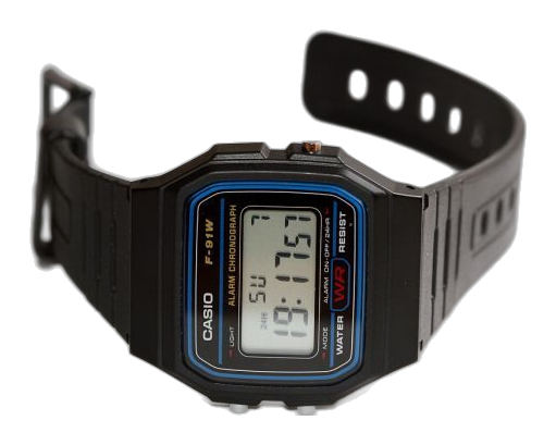
The same company’s thin, black, plastic digital watch, which entered the catalogues in 1989, on the other hand, makes no claim at all: alarm, stopwatch, light. It became one of the best-selling watches in the world. Casio’s two watches show two different paths of design: one solves a single problem to the very end, and the other gives the least that is needed at the lowest price.
08Watches: the stage on the wrist
The watch is the smallest and most crowded stage of design. A movement, a way of reading the time and an identity are fitted into a circle 3–4 cm in diameter.
Legibility. In 1944 Hans Hilfiker, an engineer of the Swiss railways, redesigned the station clock: no numerals, only black lines. He added the second hand with a red disc at its tip in 1953. Passengers entering the station set their pace by that red disc. In 1986 the clock became a wristwatch under licence; in 2012 a computer company used the same dial for the clock on its tablet. In 1947 Nathan Horwitt tried the opposite: there is no mark on the dial, only a single dot at twelve o’clock. Because it was exhibited in museums, it came to be known as the “museum watch”. Max Bill, who had studied at the Bauhaus, designed a kitchen clock for a German watch manufacturer in 1956 and a wristwatch in 1961; its fine lines and plain numerals have been produced almost unchanged for sixty years. Braun’s wristwatch of 1989 belongs to the same family.
Quartz. On 25 December 1969 the first quartz wristwatch went on sale in a shop in Tokyo. It had a gold case and its price was USD 1,250; the price of a small car in those days. Within ten years the same manufacturer brought the price of the watch down to 2–3% of the first price. The first digital watch, which appeared in America in 1972, was a gold bracelet whose red numerals lit up when a button was pressed. Accuracy, the most expensive feature of a watch, became its cheapest feature within a few years.
Swatch. Switzerland’s answer was design rather than engineering. Two young engineers, Elmar Mock and Jacques Müller, took an idea that had been tried in the thinnest watch in the world of those years: let the back of the case also be the base of the movement. The movement was built directly into the plastic case, the parts could be placed from above by a machine, and the case was closed by ultrasonic welding. The first name of the project was “Vulgaris”, that is, ordinary.
The watch was no longer a single object for a lifetime but an accessory sold in seasonal collections, of which people bought several. The money earned allowed the expensive mechanical brands of the same group to get back on their feet. The price, too, lay within the design: a case closed by welding cannot be opened, and the watch cannot be repaired. The product that saved an industry was also the product that carried the logic of use-and-throw-away onto the wrist.
09On the desk: two stories of a pencil sharpener
A small object shows the idea of a period more nakedly than a large one. Two pencil sharpeners illustrate this well.
The one that was never produced. In 1933 Raymond Loewy patented a chrome-plated, teardrop-shaped pencil sharpener whose handle resembled a bullet. Critics asked at once: if a pencil sharpener is not going to fly through the air, why is it streamlined? The object never went into production. The only example stood on Loewy’s desk for years; a designer who joined the office as an apprentice in 1942 had the task of sharpening the boss’s pencils every morning, and he wrote that the sharpener was of no use and that he used an ordinary desk sharpener. Even so, on the postage stamp of 2011 commemorating the pioneers of American industrial design, it was that pencil sharpener that represented Loewy. One of the best-known designs of the period is an object that was never sold and never worked properly.
The one that is still produced. In the Basque region of Spain, in a town known for its gunsmiths, two former workers set up a workshop in 1920 and began to produce quality revolvers. When the crisis of 1929 made sales of firearms collapse, they turned to making staplers and pencil sharpeners on the same machines; the first desk set appeared in 1932. Their desk sharpeners with a crank are still produced today, polished by hand and numbered, and they work like the mechanism of a revolver. A trade disappeared; its skill lived on in another object.
When the two are placed side by side, the difference shows. Loewy’s is an image; its function was thought of afterwards. The other is a mechanism; its beauty comes from its workmanship. The whole design debate of the century lies between these two desk objects.
10From drawing to tooling: how were objects designed?
Before the computer, a product was thought out in three languages: the sketch, the technical drawing and the model.
The sketch. The idea begins on paper, very often on whatever is at hand. It is no exception that the lemon squeezer was drawn on a restaurant place mat; design offices are full of napkins, envelopes and the margins of notebooks. The sketch searches for the form; it gives no dimensions.
The technical drawing. The form that had been decided on was drawn at full scale on the drawing board with ruler, set square and compasses: front, side and top views, and a section. The craftsman who was to make the tooling for a kettle or a radio looked only at this drawing. Changing the radius of a single curve meant drawing the whole sheet again. This is why the products of the period have many flat surfaces, circles and corners of constant radius; they are easy to draw and easy to tool.
The model. The form on paper changes when it is taken in the hand. Full-scale models were made of wood, of plaster and later of rigid foam; they were held in the hand, placed on the worktop, and their buttons were pressed. In Braun’s small design team, model making was the job of a separate specialist. Even the weight was tried: lead was put inside the model, and people looked at how it sat in the hand.
The prototype. The first working examples, on the other hand, are a matter of patience.
These two numbers show two different methods. Dyson solved a single physical problem, separating dust from air, through thousands of small changes; each failed attempt gave direction to the next. Sony’s engineers, by contrast, invented nothing new; they brought existing parts together for a new use. The first is invention and the second is design, and both end with the same thing: a working example put into the hand of a real person. The two hundred attempts at the unbreakable watch, the testing of the peeler in a hand with arthritis and the deliberate weighting of the kitchen machine are work of the same stage.
After the 1980s the screen took the place of the drawing board; curves that cannot be drawn with a ruler came to be drawn and tooled. Today a model is printed in a few hours. But the sequence has not changed: first the idea, then the dimensions, then something held in the hand. A stage that is skipped comes back, with its price, in the section below.
11The price of wrong design
The history of design is very often told as an exhibition of beautiful objects. Yet a considerable part of the present form of the objects in the home consists of decisions taken after someone had been harmed. The figures in the examples below are from America, because the most regular records were kept there; the mistakes, however, are the same in every country.
| Product | Mistake | Price | Correction |
|---|---|---|---|
| Refrigerator | The door was locked by a latch that could be opened only from outside | Children who climbed inside while playing hide-and-seek could not get out. Of the 54 children trapped between January 1954 and June 1956, at least 34 sadly lost their lives | The law of 1956: the door must open when pushed from inside. Today’s magnetic gasket took the place of the latch |
| Hair dryer | There was no device to cut the current when it fell into water | An average of 18 lives lost a year at the beginning of the 1980s; most of them in the bath, and nearly half of them children under ten | The standard of 1991: protection inside the plug that cuts the current whether the appliance is switched on or off. This is the large box on the plug |
| Medicine bottle | The cap was of a kind that a child could open easily | Until the beginning of the 1970s aspirin was the leading cause of poisoning in small children | The law of 1970: the push-and-turn cap. When adults could not open it either, the test method was changed in 1995 with older people in mind |
| Lawn dart | A heavy dart with a pointed metal tip, for a garden game | Serious injuries and loss of life | In 1988 its sale was banned altogether; a warning label was not considered sufficient |
| Drop-side cot | A side panel that slid down for easy access; when its hardware wore, a gap opened | After 2000 at least 32 babies sadly lost their lives, trapped in the gap; millions of cots were recalled | In 2011 its production and sale were banned; the cot standard was renewed for the first time in thirty years |
| Chest of drawers | A body that could tip forward when the drawers were opened, used without being fixed to the wall | In the models of a single manufacturer, six children sadly lost their lives; in 2016, 29 million chests of drawers were recalled | A wall-fixing kit, refunds, and pressure for the tip-over test to become compulsory |
Three conclusions follow from this table.
A warning label does not count as design. In the case of the chest of drawers, the manufacturer first distributed a fixing kit and a warning; this programme, carried out after two lives had been lost, did not prevent the third. In the case of the hair dryer, by contrast, the problem was solved not by telling the user “keep it away from water” but by putting a circuit inside the plug. When safety is left to the user’s attention, sooner or later someone will be inattentive. The fault must be removed inside the product.
The designer has to think of the weakest user. In almost all of these examples it is a child who is harmed, and in none of them was the product “used wrongly”; the child did what a child will do. The hair dryer standard, too, was extended after the behaviour of children had been studied: a child would also throw an appliance that was switched off into the water.
A good correction becomes invisible. That a refrigerator door opens with a light pull and closes softly looks like a detail of comfort today. In fact it is a safety measure, and it has been solved so well that nobody notices it. The medicine cap is an example of the opposite: correcting the first solution, which protected the child while making things hard for older people, took twenty-five years.
Apart from safety there are quieter harms as well: the watch that cannot be repaired, the razor whose head is thrown away, the device whose battery cannot be replaced. These injure nobody, but each is an object designed to be thrown away, and we pay its price somewhere else, at some other time.
12From outside: crisis, war, technology
None of these objects was born on a designer’s desk alone. Behind each of them there is a condition that the designer did not choose.
| Outside factor | What happened | Its mark on objects |
|---|---|---|
| The arrival of electricity in the home | Appliances with motors and heating elements came out onto the worktop | Mixer, toaster, radio: the object that could not be put away had to be beautiful |
| The depression of 1929 | Sales stopped, and manufacturers began to renew the outside of the product | The streamlined style, the teardrop-shaped pencil sharpener; the stapler that came out of a gun workshop |
| The Second World War | The aluminium, plastics and electronics industries grew; factories were left empty | Light metal kitchenware, the cheap and sturdy tools of the post-war years |
| Post-war prosperity | Domestic service declined, and the kitchen became the owner’s | The kitchen machine, the tool left in view, the “good design” exhibitions |
| The transistor and the chip | The inside of the device shrank, and its form became independent of the mechanism | The pocket radio, the pocket calculator, the cassette player, the digital watch |
| Quartz, 1969 | Accuracy became cheap; the mechanical watch industry collapsed | The plastic fashion watch, the unbreakable watch; the mechanical watch turning into a luxury object |
| The oil crisis, 1973 | Energy and plastic became expensive, and growth stopped | The small, the economical and the long-lived valued again |
| The plentiful credit of the 1980s | The young, urban buyer with a high income; expressing identity through objects | The kettle with a designer’s signature, the squeezer that does not squeeze lemons |
| Consumer safety laws | Accidents were recorded, and standards became compulsory | The magnetic door, the protected plug, the child-resistant cap |
Looking at the sequence, a pattern appears: the most lasting objects came out of constraint rather than abundance. The stapler is the product of a crisis, the plastic watch of the collapse of an industry, the first cassette player of making do with the parts at hand, and the peeler of an illness. The years of abundance, by contrast, produced more signatures and more show.
13The brands side by side
| Brand | Foundation and designers | Signature product | Its idea |
|---|---|---|---|
| KitchenAid | 1919; Egmont Arens | The Model K mixer, 1937 | If the form comes from the job, it does not change for eighty years |
| Bialetti | 1919; Alfonso and Renato Bialetti | The Moka pot, 1933 | One material, one product |
| Kenwood | 1947; Kenneth Grange | The kitchen machine, 1950 and 1960 | Weight and durability give confidence |
| Braun | 1921; Hans Gugelot, Dieter Rams, Dietrich Lubs | SK4, T3, ET66 | Less, but better |
| Bang & Olufsen | 1925; Jacob Jensen, David Lewis | Beogram 4000, 1972 | The technical solution determines the form; the device is furniture |
| Alessi | 1921; Sapper, Graves, Rossi, Starck | The kettle with the bird, 1985 | An everyday object can carry a signature |
| Sony | 1946; Ibuka, Morita and their engineers | Walkman, 1979 | Make it small and give it to the individual |
| Casio | 1946; the Kashio brothers, Kikuo Ibe | Casio Mini, G-Shock | A tool that everyone can afford and that does not break |
| Swatch | 1983; Mock, Müller, Thomke, Hayek | The plastic quartz watch | Reduce the parts, turn the watch into fashion |
| OXO | 1990; Sam Farber, Smart Design | The peeler with a soft handle | Design for the hand that has the most difficulty |
| Dyson | 1991; James Dyson | The bagless vacuum cleaner, 1993 | Keep trying until the problem is solved |
14What it brought, what it took away
Minimalism stands in the middle of this balance sheet. Rams’s principle of “as little design as possible” was not born as a proposal for a style; it was the thought that, once what is unnecessary has been removed, what remains will last longer. Later generations very often took it only as an image: white, with rounded corners, without buttons. A device without buttons is not always more understandable; sometimes it is only more bare. For less to be good, everything that is removed must really be unnecessary.
15Synthesis: what does an interior architect learn from these objects?
A kettle and a room are designed with the same questions. There are five conclusions from this story that can be carried over to space.
- What cannot be put away has to be beautiful. The mixer was designed when it came out onto the worktop. In a home, too, everything that will remain in view, that is, the socket, the switch, the door handle, the radiator, the air conditioner, is a decision. To dismiss them as “technical elements” is to put the mixer of 1919 on the worktop.
- The hand decides before the eye. The kitchen machine made heavier, the peeler with a thick handle, the refrigerator door that opens lightly. In a space, too, the feeling of quality is given most by the places that are touched: the handle, the handrail, the drawer runner, the sound of the switch.
- A decision without a prototype is expensive. Five thousand attempts are not needed, but one trial at full scale catches most mistakes: setting up the height of the worktop in cardboard, holding the lamp in the hand and switching it on before fixing it, sitting in the armchair before ordering it.
- Think of the weakest user. The cupboard that does not tip over, the worktop with a rounded corner, the floor that is not slippery, the socket that a child cannot reach, a place for an older person to hold on to. These are cheap and invisible not as measures added later but as decisions taken at the start. Fixing a tall cupboard to the wall should not be regarded as a matter of preference.
- Separate the signature from the job. A sculpture may stand on the worktop; the lemon is squeezed with something else. The problem arises when the sculpture is bought as a squeezer. In a space, too, what is put there for show and what is used every day should not be confused with each other; the second should never be compromised.
At the end of a hundred years we are left with two kinds of object. Some have been produced in the same form for eighty years, pass from hand to hand and are repaired. Others give away the year in which they appeared at a glance and have long since been thrown away. The difference between them has very often not been the budget. The first were designed as an answer to a question, the second as an answer to an image. This distinction, as it applies to space, is the subject of our article on timeless design.