01A pendulum a hundred years long: factory, landscape, cubicle, open office
The history of the office is a pendulum that swings between the same two ideas: being able to see people, and leaving people in peace.
At the beginning of the 20th century the office was a paper factory. The approach that measured work with a stopwatch in the factory was carried into the office: hundreds of clerks sat in rows facing the same way, and supervisors watched from a raised place or from glazed rooms. The space had been designed for supervision.
At the end of the 1950s two brothers working as consultants in Germany turned this order upside down. In their “office landscape” there were no walls and no doors; desks were placed in irregular clusters according to the flow of paper and of conversation, plants and curved screens came between them, and manager and clerk sat in the same hall. The idea suited the egalitarian mood of post-war Germany and it was inexpensive: it could grow and shrink without a wall being built.
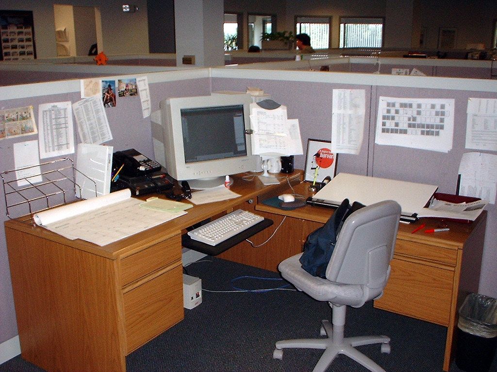
In 1964 Robert Propst, who ran the research division of a furniture company in America, studied the day of the knowledge worker and brought another proposal: a movable arrangement in which one could work standing or seated and build one’s own surroundings. Its second version appeared in 1968 and became the best-selling office system in history. Companies liked not its flexibility but the fact that it could be compressed. The panels were brought to a right angle, the boxes became smaller and were lined up side by side: the cubicle, the small workspace enclosed by low panels, was born. Thirty years later Propst called the place his own invention had reached “monolithic insanity”.
In the 1990s the pendulum swung again. Technology companies took the cubicles apart and sat everyone at a single table; the stated reason was collaboration and transparency, and the result was a saving in square metres. In 2018 two researchers measured, with sensors worn by the staff, who spoke with whom and for how long in two large companies that had moved to the open office. Face-to-face conversation had fallen by about 70%, and e-mail and messaging had risen. When the walls came down people put on headphones. Then 2020 arrived, everyone worked from home, and the question of what the office is for was truly asked for the first time.
This story has its own version in Turkey. The office of the government department and of the family company was built around the makam odası, the room of the person in authority: a secretary at the door, a large desk inside, guest armchairs facing it and a çay ocağı, the small tea kitchen. The space spoke not of work but of hierarchy and of receiving guests. In the 2000s the open office arrived with office towers and call centres; but the tea kitchen did not disappear, because here half of every business conversation takes place over tea. A good office plan does not ignore this habit; it makes room for it.
02The first question is not square metres: what do people do all day?
The debate between the open office and the closed room is the wrong question. Nobody does the same work all day. An employee’s day divides roughly into four kinds of work, and each asks for a different space:
| Work | What it needs | Its space | Its greatest enemy |
|---|---|---|---|
| Concentration | Quiet, no interruption, a protected back | Quiet zone, single rooms, library arrangement | Intelligible speech |
| Working together | Writable wall, screen, free conversation | Small meeting rooms, project tables | The worry of disturbing those nearby |
| Calls | Privacy, good sound, good light | Telephone booths, video-call rooms | Echo, people passing behind |
| Meeting by chance and rest | Somewhere to sit, a drink, daylight | Kitchen, tea kitchen, wide stair landing | Closeness to the quiet zone |
That is why the first step of planning is a count. For two weeks look at what people really do: how many of the desks are empty, how many people attend most meetings, where are telephone calls made? The same thing emerges in almost every office: most meetings are for two to four people, but most rooms are for twelve; two people occupy the large room and ten cannot find a place. The remedy is to reduce the large rooms and multiply the small ones.
03Psychology: the sense of control, the back and territory
Control. What best explains satisfaction with an office is not the size of the desk or the price of the furniture but whether the person has a say over their surroundings. Someone who can raise and dim their light, open their window and close a door when they wish complains less about the same conditions. That is why a good office does not try to give everyone the same perfect condition; it gives choice.
There is a classic story of this. In 1924–27 the effect of light on output was tested in a factory in America. The light was increased and output rose. The light was reduced and output rose again; it fell only when the light came down to the level of moonlight. For years the result was interpreted as “people worked better because they were given attention”. Those who later looked at the data again showed that the effect was not as large as it had been told. There are two lessons to draw: asking employees for their opinion is useful in itself, and every “proven” claim about the office should be met by asking for its measurement.
The back. A person is at ease where their back is protected and they can see in front of them; it is a preference left from the cave. A desk with its back to the corridor and its screen open to everyone who passes keeps its owner on the alert all day. Setting desks against a wall or a low cupboard, and running the walking route beside those seated and not behind them, is an improvement that costs nothing.
Distance. The distance between people has a language too. The zone up to roughly 45 cm is open only to those close to us; up to 1.2 m is personal space; business conversations are comfortable between 1.2 and 3.6 m. Two people sitting side by side at desks 120 cm wide are inside each other’s personal space all day. A low screen or a plant between them, or moving the desk by 20 cm, changes far more than is supposed.
Territory. A person wants to make the place where they work their own: a photograph, a plant, their own cup. The arrangement in which desks are shared anew every morning gains square metres and takes this feeling away. If it is to be applied, at the least a personal locker, a “neighbourhood” belonging to the team and an order that does not change should be given; otherwise people come early in the morning and always take the same desk, and nobody is satisfied.
Status. The corner room and the large desk have been the language of rank for a hundred years. Today, to give the best façade to the closed rooms of managers cuts both daylight and trust from the inside. The better arrangement is to take the closed rooms to the core and leave the glass to everyone. The manager’s need for privacy is real; what meets it is not the view but the door.
04Anthropometry and ergonomics: the measure of the body does not bargain
Anthropometry is the science of the measurements of the human body, and its basic rule is this: do not design for the average person, because there is no average person. Dimensions such as passage and clearance are set by the large body, dimensions such as reach and sight by the small body; everything in between must be adjustable. A desk of fixed height is high for half the staff and low for the other half.
| Dimension | Common value | Why |
|---|---|---|
| Desk | 160 × 80 cm; at least 120 × 80 cm | A depth of 80 cm is needed for the distance to the screen |
| Fixed desk height | 72–75 cm | Set by the average; that is why it does not suit everyone |
| Space behind the chair | At least 100 cm; 120 cm if people pass behind | The chair is pushed back and someone passes behind |
| Main circulation route | 150–180 cm | Two people meet, and one may be in a wheelchair |
| Area per person | 6–8 m² per desk; 10–14 m² with shared areas | Below this, problems of sound and air multiply |
| Air volume per person | At least 10 m³ | The lower limit of workplace legislation in Turkey |
| Sitting and standing | A change of posture every half hour | The best posture is the next posture |
The least understood side of ergonomics is the last. To sit for eight hours without moving in a perfectly adjusted chair is harmful too. The body is made for movement. A good plan makes a person walk during the day: the printer is not beside the desk, the kitchen is at the other end of the floor, and the meeting room is one floor down. This looks like inefficiency; in fact it feeds both the body and chance meetings.
05Light: 500 lx is not enough
The standards ask for 500 lx on the desk for writing and screen work, set an upper limit for glare and require that colours appear correctly. These are minimum conditions and do not by themselves mean good light. An office that fills the ceiling with evenly spaced luminaires and obtains 500 lx everywhere complies with the rules and is tiring.
- Daylight comes first. The human body sets its clock by daylight; those who work near a window sleep better. Daylight enters a room to a depth of about twice the height of the window head; beyond that the plan is deep and is left to artificial light. Desks that are occupied continuously are placed in this band, and stores, archives and meeting rooms in the depth.
- The screen stands at right angles to the window. If the window is behind the screen the eye is dazzled, and if it is in front it is reflected in the screen. The desk is placed so that the line of sight is parallel to the glass. Solar control is part of the plan as well; a façade whose blinds are always closed has lost the design from the outset.
- Surfaces complete the light. The same luminaire does half the work in a room with a dark ceiling. The ceiling should be light, the walls of medium lightness and the floor darker. The desk surface should be neither glossy white nor black; the first dazzles, and the second sets up a contrast with paper that tires the eye. A matt surface of medium tone is the most comfortable.
- Layers. General light that is low and soft, a task light on the desk that the person can raise and dim, and indirect light on the walls and ceiling. A room whose walls are lit is perceived as more spacious and brighter, even if the measurement on the desk is the same.
- Change through the day. Cooler and stronger light in the morning, warmer and dimmer towards evening, suits the rhythm of the body. At the least it should be possible to dim the light in meeting rooms and rest areas.
How light is layered is the subject of our article on lighting. In my master’s thesis I examined the sub-spaces created with light in museum and exhibition spaces; the same thinking works in the office. Without building a wall, only by changing the level and the colour of light, a quiet corner, a gathering place and a route of passage can be defined within one hall.
06Sound: the problem is not noise but intelligible speech
Sound comes first among the complaints in the open office, and most of it is wrongly diagnosed. What distracts a person is not the loudness of the sound; we can work comfortably in a café. What distracts is speech that can be understood. The brain cannot manage not to listen to a sentence whose words it can make out. That is why the one-sided telephone call at the next desk is more tiring than a drill.
A surprising conclusion follows from this: a very quiet open office is worse than one with a moderate hum, because in silence every word carries far. The remedy has three steps:
- Absorb. The largest surface that carries speech far is the ceiling. An absorbent ceiling, carpet or a soft floor, absorbent screens between the desks. The fashion for glass, concrete and the bare ceiling leaves the cost of the acoustics to the employee.
- Block. Speech spreads in a straight line; if a cupboard or screen higher than head level comes between two seated people it is clearly reduced. Closed booths for telephone and video calls are no longer counted a luxury: one for every ten to fifteen people is a reasonable start.
- Mask. The light, continuous sound of the ventilation, or sound systems installed for this purpose, make distant speech unintelligible. Sound whose words cannot be made out does not distract.
In meeting rooms the problem is the reverse: the conversation inside must not leak out. A partition that does not rise to the slab carries sound over the suspended ceiling to the neighbouring room. A glass partition looks elegant and, if it is single glass, insulates little; the gap under the door undoes everything else. The principles of mass, spring and airtightness are the subject of our article on acoustics; all of them hold in the office exactly as they do there.
07Air and temperature: the output that is not seen
The drowsiness that descends at three in the afternoon does not always come from lunch. In a crowded meeting room carbon dioxide rises severalfold within an hour, and the ability to make decisions falls measurably. It is easy to measure: an inexpensive sensor is hung on the wall. If the figure exceeds 1,000 ppm the room is insufficiently ventilated. Small meeting rooms and telephone booths are the places most at risk in this respect; their volume per person is small and their ventilation is very often forgotten.
In temperature there is no degree that satisfies everyone. People’s thermal preference differs by a few degrees with build, clothing and the work they do; the common comfort calculations, moreover, were set up decades ago on the body of a man in a suit, which is why most of those who feel cold in offices are women. The solution is again choice: different thermal conditions such as beside the glass and in the inner zone, a window that opens, and the person being able to choose their own place. 21–24 °C and 40–60% humidity is a good range to start from.
The plant belongs here too. A pot plant does not clean the air measurably; those who expect this are disappointed. But being able to look at green and at the outside is restful; the classic study showing that patients who see a tree from their window recover more quickly has been known since 1984. The plant is not ornament but a distance to look at: the place where the eye rests when it lifts from the screen.
08Material: how will it look in ten years?
An office wears many times more than a home: chairs on castors, hundreds of passages a day, cleaning every day. Material is chosen for this load, not for the photograph in the catalogue.
| Surface | Good choice | To be avoided | Why |
|---|---|---|---|
| Floor | Carpet tile of heavy-duty class; hard floor only in circulation | Glossy hard floor everywhere | Carpet takes up footfall and echo; tiles are replaced one by one |
| Ceiling | Suspended ceiling or hung panels of high absorption | Bare concrete with no absorber | It is the ceiling that carries speech farthest |
| Partition | From slab to slab; if glass, double and laminated | A partition that ends at the suspended ceiling | Sound travels round over the top |
| Desk surface | Matt, medium tone, with an impact-resistant edge | Glossy white, black, glass | Glare, contrast, fingerprints |
| Chair | Adjustable, with lumbar support and replaceable fabric | Pleasing to the eye, not adjustable | It is the only object sat on for eight hours |
| Paint, adhesive, board | With low emission of volatile compounds | Products of uncertain origin | The source of the headache in a new office is very often this |
Quality does not mean expense; it concerns what the money is spent on. The order of the budget is clear: first the chair, then the acoustic ceiling and the light, then the air, and last the visible surfaces. In most offices the order is exactly the reverse: a budget is found for the stone cladding at reception, and the chairs are bought from the cheapest. A flexible infrastructure laid from the floor is also part of long life: the company grows and teams change places; an office with its sockets buried in the wall is broken open at the first change.
09What does not work? Ten common mistakes
- Putting the kitchen or the printer beside the quiet zone.
- Rows of desks with their backs to the corridor.
- All meeting rooms large; no telephone booth at all.
- Giving the best façade to closed managers’ rooms.
- Leaving the ceiling bare concrete, the floor hard and the wall glass, and postponing the acoustics.
- Light of the same level and the same colour everywhere, which cannot be dimmed.
- Placing screens facing the window or with their backs to the window.
- Moving to shared desks without giving a personal locker and a team zone.
- Forgetting the ventilation of small rooms.
- Planning by the calculation of square metres alone, without asking the employees.
10What did it bring, what did it take away?
The open plan brought real things: daylight reached the interior, hierarchy softened, and teams could grow and shrink without breaking walls. In return it took away privacy and quiet; the cubicle, for its part, brought isolation without being able to give either. The result of this hundred-year experiment is simple: no single layout suits everyone and every task.
Working from home showed one more thing. Work done alone can be done anywhere; the reason for coming to the office is no longer the desk but the other people. That is why the good office of today means fewer desks, more rooms and a better kitchen: quiet for the one who wants to concentrate, a door for the one who wants to talk, a glass of tea for the one who wants to meet.
What we have seen while working in different building types such as the factory, the hospital, the restaurant and the home is the same in the office: a space either makes the work inside it easier or makes it harder; it does not stay neutral. The question to ask when planning an office should be not “how many people fit?” but “how do these people do their best work here?”. The answer to the first is a number. The answer to the second is a plan.