01Let us begin with a misunderstanding
In first meetings we hear two sentences very often. One is: “Keep it simple, but it should not look empty.” The other is: “Make it impressive, but it should not be tiring.”
The two sentences seem to be opposites. In fact both ask for the same thing, and both rest on the same assumption: that simplicity and grandeur are the two ends of a single line, so that moving towards one means moving away from the other.
A visit to Rome is enough to see that this is not so. Think of the Pantheon. One volume, one dome, one eye at the top that opens to the sky. There is almost no “thing” inside it. And yet for two thousand years everyone who has walked through its door has fallen silent for a moment. Is it simple? Extremely. Is it grand? Even more so.
So there is no single line. There are two questions, independent of each other:
- How many things are in the space? The answer places us somewhere between “simple” and “dense”.
- How strongly does the space affect a person? The answer places us somewhere between “ordinary” and “grand”.
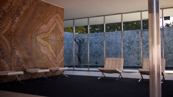
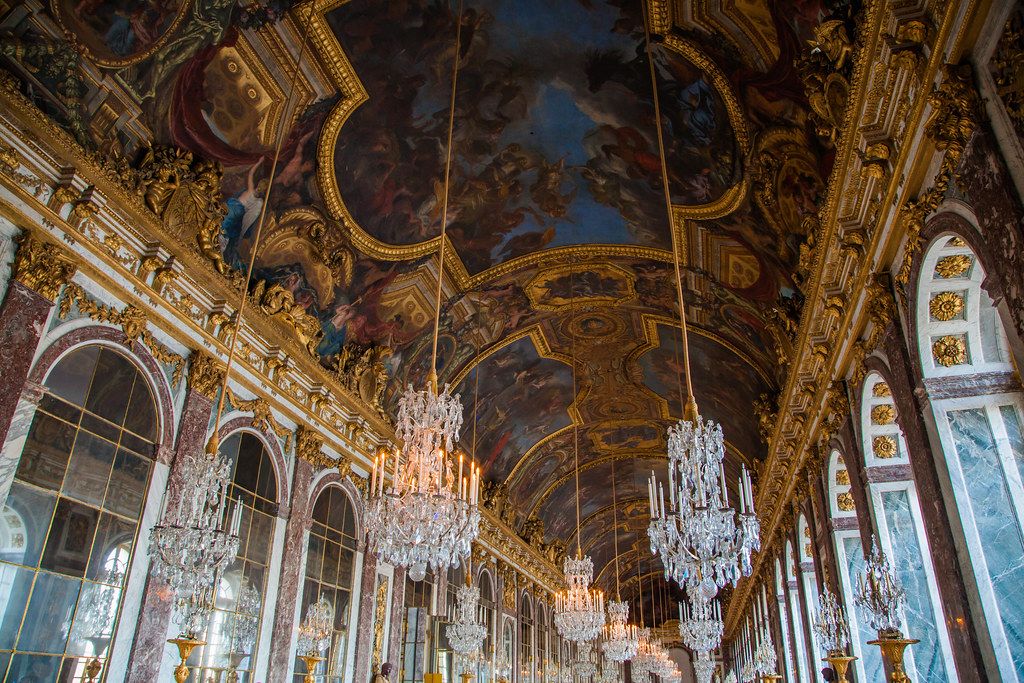
Look at the upper row of the map. The Hall of Mirrors at the Palace of Versailles is 73 m long and carries 357 mirrors; the Ceremonial Hall of Dolmabahçe Palace in Istanbul is filled with crystal, gilding and pattern. Both are grand. On the left of the same row stand the Pantheon, Mimar Sinan’s Selimiye Mosque in Edirne, and the pavilion that Mies van der Rohe built in Barcelona in 1929. They are grand too, but by an entirely different route.
The lower row teaches more. Emptying a space and painting it white makes it simple, but it does not make it impressive. Filling it with expensive things only makes it dense. The rest of this article is about how to move from the lower row to the upper one.
02Simplicity is a matter of choosing
Everyone knows the phrase “Less is more”; it has become inseparable from the architect Mies van der Rohe. The designer Dieter Rams’s sentence seems more accurate to us: “Less, but better.” The real weight of that sentence is carried by its second half.
Taking some things out and leaving the rest as it is does not make a space simpler; it only leaves it with less. Everything that remains has to be good enough to do the work of what was removed as well. The Barcelona Pavilion has only a handful of elements: a few walls, eight slender columns, a surface of water. But one of those walls is a single slab of onyx whose veins run across it like a painting. Mies removed the ornament and put the material itself in its place.
A conclusion follows from this that is rarely stated: simple work is harder than crowded work, and often more expensive. Why?
Ornament hides mistakes. If you fix a skirting board where the wall meets the floor, that junction no longer has to be accurate to the millimetre; the skirting covers the flaw between them. If you fix an architrave around the door, the gap between frame and wall disappears from view. A simple space has none of these covers. The wall comes down to the floor bare, the door sits in the same plane as the wall, and the joints continue in line from one room to the next. Because the eye finds nothing else to rest on, it catches the smallest deviation at once.
Ornament hides the mistake; a plain surface magnifies it.
That is why the sentence “keep it simple and keep it cheap” usually contradicts itself. In simple work the money goes less into material and more into workmanship and preparation.
We should also say what simplicity is not. An empty room, a cold room and a room painted white from top to bottom are often mistaken for simplicity. In “In Praise of Shadows”, written in 1933, the Japanese author Tanizaki attributes the beauty of the traditional Japanese room to the way light filters through a paper screen and slowly fades in the dim corners. Those rooms are extremely simple, yet they do not feel empty at all, because light and shadow fill the emptiness.
03Grandeur is a feeling
We usually think of the word grandeur together with gold leaf, crystal and marble. Our definition is different: grandeur is what makes you slow down for a moment when you enter a space, lower your voice, lift your head and look. In that moment a person feels a little smaller, and the space a little larger.
Five sources produce this feeling, and none of them is “a lot of objects”:
- Proportion. The height of a ceiling, the width of an opening, the unbroken length of a wall. The measure of the space in relation to the person.
- Light. Where it comes from, what it strikes, where it ends.
- Material. Surfaces that are not imitations, that grow more beautiful as they age, and that you recognise by touch.
- Emptiness. Space in which nothing has been placed, left empty on purpose.
- Workmanship. The cleanness of the line where two materials meet. The quietest and most expensive source of grandeur.
This may sound like a matter of feeling, but it has also been measured. In experiments published by Meyers-Levy and Zhu in 2007, participants were placed in rooms with ceilings of about 2.4 m and 3 m. Those in the room with the high ceiling thought more readily of ideas related to freedom; they reasoned in a more abstract and more integrated way. Those in the room with the low ceiling concentrated on detail. A ceiling does not only stand above our heads; it also affects the way we think.
This is also where the line between grandeur and show is drawn. Grandeur comes from the space itself: from its proportion, its light and the labour in it. Show leans on the price tag; it wants to say “this is expensive”. The first gains value as the years pass; the second becomes tiring on the day it goes out of fashion.
In Turkey this line has a history. Two generations ago the best objects of the home were bought not to be used but to be shown: the set in the display cabinet, the closed door of the guest room, the armchair under its cover. Show was not counted a fault there; it was the language of respect for the guest. When we hear the sentence “let it be showy” today, very often it is that language we are hearing. Our task is not to look down on it but to find the way of expressing the same respect not with a price tag but with proportion, light and workmanship. The story of those objects is the subject of the article on the order of the home.
04Why do the eyes tire?
Have you ever left a shop, a wedding hall or a house with a headache? There is a physiological explanation for it.
A brain-imaging study published in 2011 by McMains and Kastner of Princeton University showed the following: every object that enters our field of view competes with the others to be represented in the visual area of the brain. As the objects multiply, the competition becomes harder, and we spend more effort to give our attention to any one thing. A crowded room makes us work, even if we do not notice it.
On the other hand, a completely bare room does us no good either. According to a finding set out by the psychologist Daniel Berlyne in the 1970s and tested many times since, the relationship between visual complexity and liking follows an inverted U.
A good interior architecture project looks for the top of this curve. The top is not in the same place for everyone: in a bedroom it moves to the left, in a restaurant to the right. But the direction is always the same: calm surfaces on which the eye can rest, and a few strong points on which it can settle.
Try it at home
The squint test. Stand in the doorway of the room and half-close your eyes. The details disappear and only the most dominant patches remain. What are the first three things you see? Are they the things you want to be seen, or a group of sockets, a tangle of cables and an air conditioner?
The one-third test. Remove a third of the objects in a room and keep them somewhere else for a week. At the end of the week, bring back only those whose absence you really felt. Most people bring back fewer than half.
05So is ornament a crime?
The Viennese architect Adolf Loos gave his famous text of the early 1900s the title “Ornament and Crime”. Half a century later Robert Venturi wrote a short reply to him and to Mies: “Less is a bore.”
Each of them is right in one respect. This is how we see the matter: ornament that has a reason is not ornament. A profile that resolves the junction of two materials, a textured surface that breaks up the echo of a hall, a handle that meets the hand in the right place, a pattern that carries the memory of a culture. All of these do a job. The problem is the thing that is repeated without a reason, added only “so that it does not stay empty”.
One question is enough to tell them apart: What do I lose if I remove this? If the answer is “nothing”, remove it. If the answer is “the character of the space”, we no longer call it ornament; it has become part of the design.
06Five decisions that bring the two together
A space that is calm and yet impressive does not come about by chance. It depends on a few decisions taken at the start of the project.
1. Choose one lead
Let every space have a single main idea: a staircase, a stone wall, a view, a light. Everything else accompanies it and does not compete with it. If everything in a room says “look at me”, you cannot look at anything.
2. Concentrate the budget instead of spreading it
If you divide the same money equally among twenty items, you get twenty mediocre things. If you concentrate it on three, you get three excellent things and a calm background that brings them forward.
A budget spread out
A budget concentrated
3. Treat emptiness as a material too
An empty wall is not “a wall on which nothing has been hung yet”. It is the surface where the eye rests and which adds value to the painting beside it. Museums know this very well: the wider the empty space around a work, the more important the work appears.
4. Give light to the walls rather than to the ceiling
The same room can look low or spacious only because its light has changed. This is a subject in its own right; our article on lighting explains it in detail.
5. Put good material where the hand touches
The door handle, the edge of the worktop, the handrail of the stairs, the inside of a drawer. People estimate the quality of a space with their eyes and confirm it with their hands. A saving made on a surface that is seen from a distance is felt far less than a saving made in a place that is touched every day.
07The balance for each kind of space
Where the balance lies depends on what the space is for. At home the weight is on the side of simplicity, because a home is lived in every day and people need to rest; grandeur is gathered in one place, for example at the entrance or on one wall of the living room. In a restaurant and a hotel lobby people come for a few hours; a denser, more theatrical language can be carried there. In an office simplicity is a matter of efficiency; grandeur belongs to the reception area and the meeting room, that is, to the places where the organisation presents itself. In a clinic simplicity gives confidence; there, grandeur takes the form of flawless cleanliness and flawless detail.
08Simplicity chooses, grandeur refines
The often-quoted thought of Saint-Exupéry applies to design as well: perfection is reached not when there is nothing left to add, but when there is nothing left to take away.
In our work this means the following: simplicity decides what will remain, and grandeur decides how good what remains will be. If room is made for both at the start of a project, they share the same room comfortably.